
Prince of Peace UX Case Study
Overview
This case study details the comprehensive redesign of the Prince of Peace Lutheran Church website. As my first project post-college, it presented an opportunity to apply user-centered design principles to create a digital presence that reflects the church's mission and serves its diverse community effectively.
Strategy
Initial meetings with the Pastor and Administrative Assistant provided insights into the church's mission, brand identity, community role, and future vision. We discussed existing challenges, project timelines, and goals to establish a strategic foundation for the redesign.
Discovery
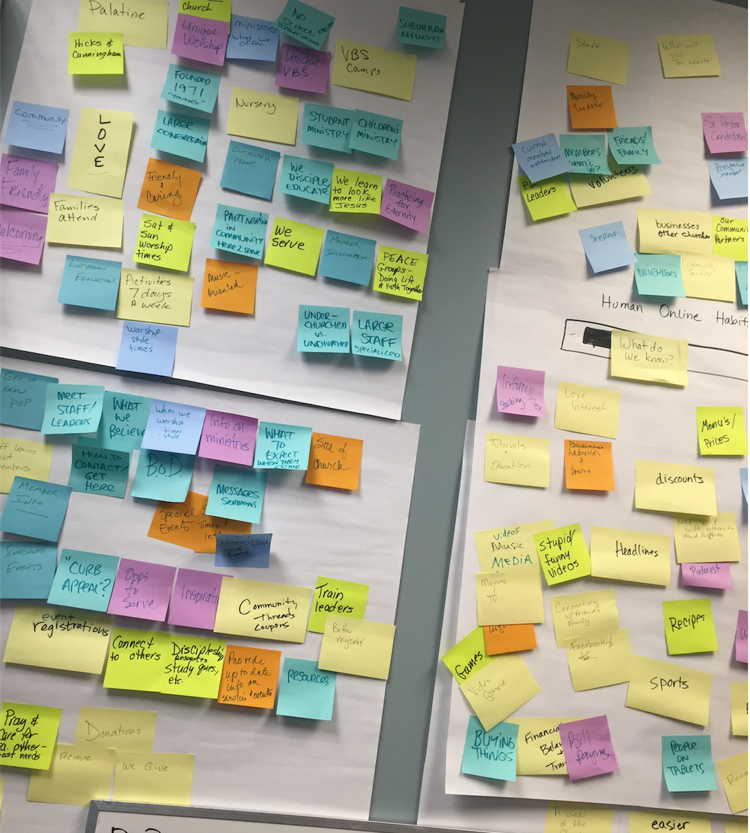
Wall of Knowledge
To gain a deeper understanding of user needs, I conducted a "Wall of Knowledge" session with staff and volunteers. This collaborative exercise revealed that Prince of Peace is a music-oriented, welcoming church with a strong emphasis on small groups. We identified a broad user base, including staff, congregants, visitors to Illinois, and local businesses.
Further one-on-one discussions with the Pastor, staff, and board members highlighted the limitations of the current website and preferences gleaned from other church websites. Each staff member's unique role informed specific user engagement requirements.
Analyzing Google Analytics data from the existing site provided additional user insights:
Gender Distribution: 41% Male, 59% Female
Top Age Groups: 35–44, 55–64, 45–54
Device Usage: Predominantly PC and mobile (77% Apple devices)
User Interests: Movies/TV, News/Weather, Arts & Entertainment, Travel, Music
These findings indicated a need to attract a younger audience and suggested a preference for clean, simple design aesthetics.
Demographic research on Palatine, Illinois, where the church is located, offered further context:
Proximity: 30 miles from Downtown Chicago; 14 miles from O’Hare Airport
Area: 12 square miles
Population: Approximately 69,350
Median Age: Men 35.5, Women 38.2
Ethnic Composition: Predominantly White, with significant Asian and Hispanic communities
Education Levels: High percentage with Bachelor's and Master's degrees
Median Household Income: $72,510
Poverty Rate: 9%
This data underscored the presence of young, educated families with decent incomes, informing design decisions to appeal to this demographic.
Website Challenges & Issues Identified
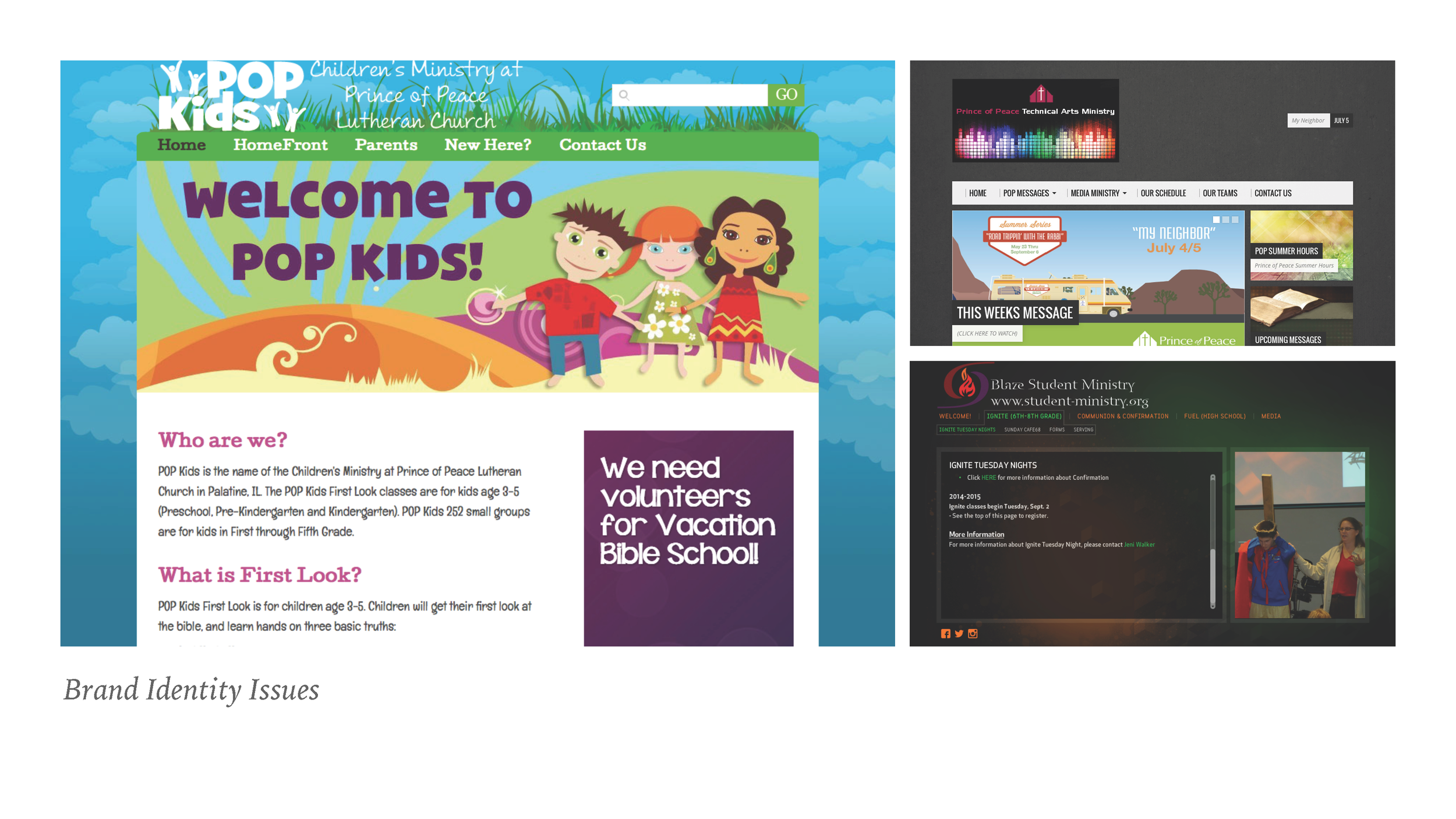
These were 3 of the 5 websites.
Prince of Peace’s digital presence was fragmented and outdated. Staff were unable to update content on the main site, prompting them to create independent pages that lacked visual and brand consistency. These unofficial sites were often unknown to the congregation, hosted on separate platforms, and even missing the POP logo.
Additional issues included:
Outdated design and non-responsive layout
Textheavy pages with minimal white space or imagery
High bounce rates and low engagement
No online system for joining small groups
Demographic mismatch with target audience expectations
Inability for internal staff to manage or maintain the site
These problems created confusion, weakened brand trust, and prevented POP from effectively serving its community online.
Analysis
Architecture and interaction design diagrams
I began by mapping user types and annotating their needs, working closely with the Pastor and staff. From there, I developed architecture and interaction diagrams to define the site’s structure and user flow. I then created low-fidelity wireframes to visually communicate page layout concepts.
Home Page Wire Frame
Contact Wire Frame
Design Approach
My first decision was selecting the right platform. I explored custom coding, WordPress, and Squarespace. After testing each, I chose Squarespace for its balance of ease-of-use and customization. The platform empowered staff to manage content independently, ensured mobile responsiveness, and offered secure, all-in-one hosting—ideal for POP’s non-technical team.
Logo Refresh
The Pastor wanted to modernize the existing logo while retaining its core identity. The original symbol referenced the church’s "Reach, Grow, Serve" mission, but that connection wasn’t clear to the congregation. I redesigned the mark using the church’s distinctive architecture as inspiration, and paired it with a clean, modern typeface for better clarity and relevance.
Brand Colors
POP had long used burgundy in its branding. I proposed expanding the palette to add visual flexibility and align with modern brand standards. Drawing inspiration from brands like USA Today and FedEx, I suggested using three colors—each linked symbolically to “Reach, Grow, Serve”—rooted in Lutheran tradition but with a fresh, engaging feel.
Brand Name
The original domain name, ReachGrowServe.org, stemmed from an outdated mission statement that few remembered—and fewer connected with. It was long, hard to recall, and didn’t reflect how people actually referred to the church. Internally and publicly, the church was already affectionately known as "POP" (Prince of Peace), so it made perfect sense to embrace the name everyone was already using.
We rebranded the domain to POPPalatine.org—short, memorable, and versatile. This opened the door for sub-brands like POP Kids, POP Music, and POP Groups, creating a cohesive and expandable naming system across ministries.Brand Personality

“unlike other talk show hosts who make fun of their guests, Jimmy Fallon has fun with his guests.” - Pastor
Photo Source (DOUGLAS GORENSTEIN/NBC: Billboard)
Brand Personality
When I asked the Pastor what celebrity best represented POP, he said: Jimmy Fallon. He explained that, unlike other talk show hosts who mock their guests, Jimmy has fun with them—and that’s how POP wants people to feel: welcomed, included, and joyful.
This insight shaped the tone of the new site. We moved away from the cold, formal voice of the old site and embraced an authentic, conversational style. I coached the team on writing with personality and referenced Henneke Duistermaat’s work on brand voice as a guiding framework.
Production & Results
Once the visual system and structure were in place, I built the site in Squarespace and migrated key content to make onboarding easier for the staff. I led training sessions, set content deadlines, and ran three rounds of user testing (internal and external). Feedback was overwhelmingly positive:
“A prospective member told me how easy it was to find information on our site and how much she loved it.”
“A leader of a coalition organizing a local March for Life said our website was excellent.”
We launched successfully on March 3, and the site continues to evolve with staff confidently managing their content and voice.
“I was talking with a prospective member this week by phone and she mentioned how easy it is to find info on our website and how much she likes it. Thought you would all like to hear!”
“Nice! I just hung up the phone with Tom who is forming a coalition of 76 local churches to form a March For Life in Palatine on October 15, 2016. He said our website was great too.”

Click the image to view the live site.